- Forms & Quality
- Managing Current Forms and Creating New Forms
- Editing a Forms Appearance - Form Builder
Editing a Forms Appearance - Form Builder
Overview
After selecting the appropriate option from the Create Form screen you will be taken to the Form Builder. If you have selected a template you will see this screen populated with the template fields.
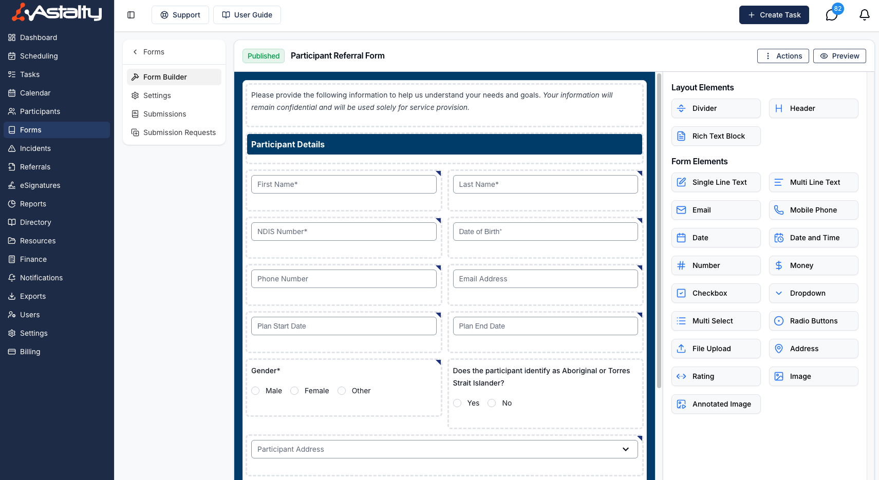
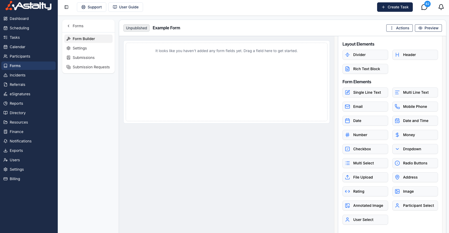
If you have created the Form from scratch you will see this screen empty.
On the left side of this screen, you’ll see the following menu options:
- Form Builder - This is the current page you are on
- Settings - Click here for more information on this page
- Submissions - Click here for more information on this page
- Submission Request - Click here for more information on this page
Navigating the Form Builder
In the centre of the screen, you’ll see the form itself. As mentioned, if you’ve selected a template, this area will be populated; if not, it will remain empty.
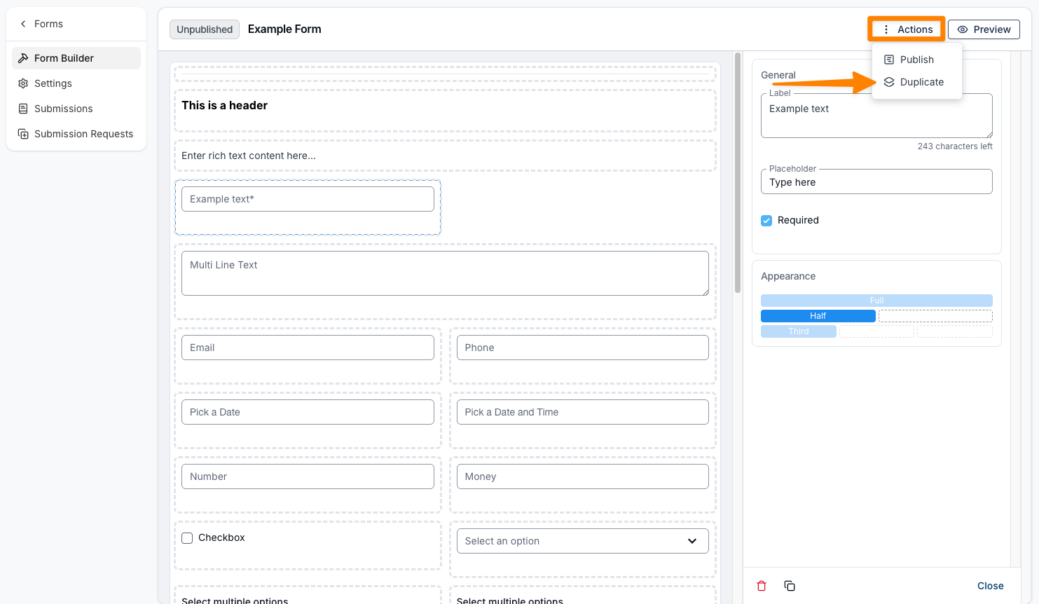
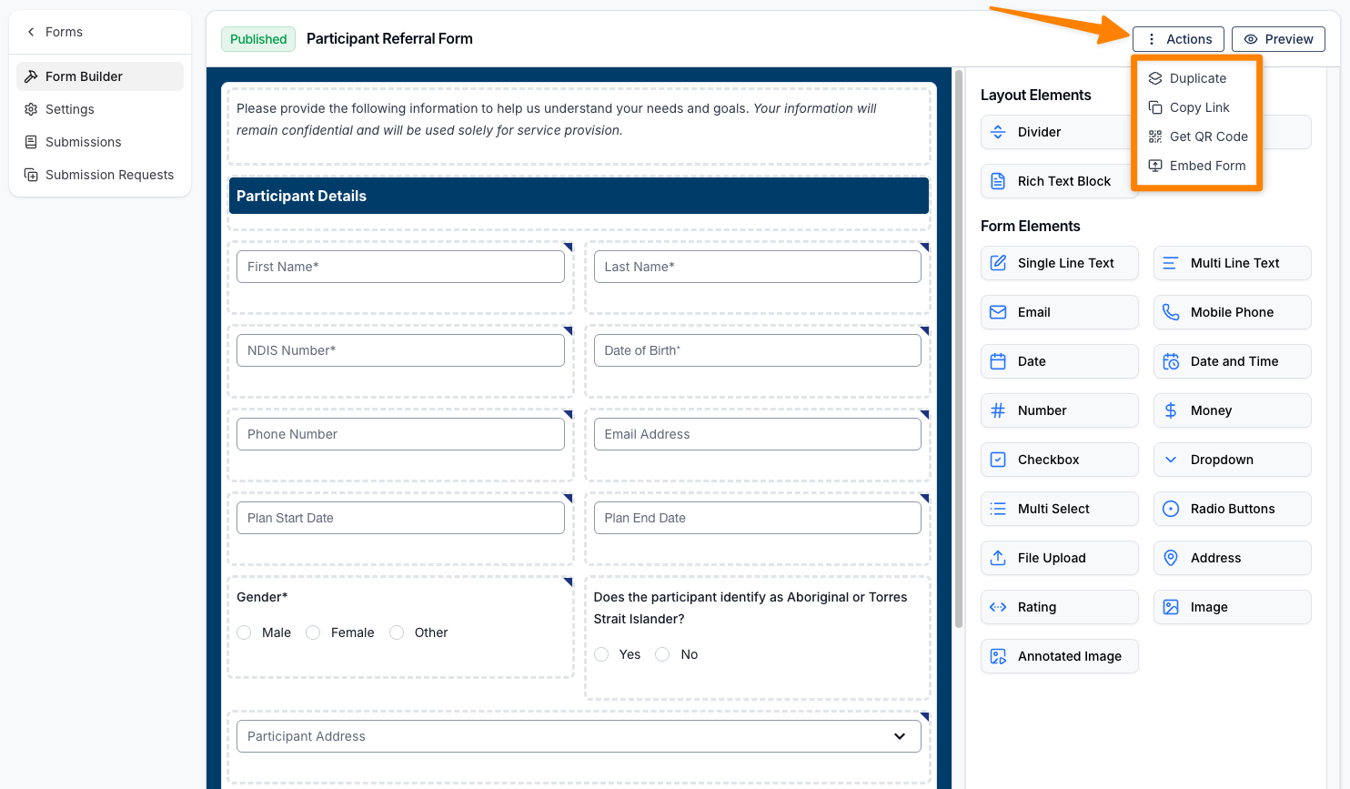
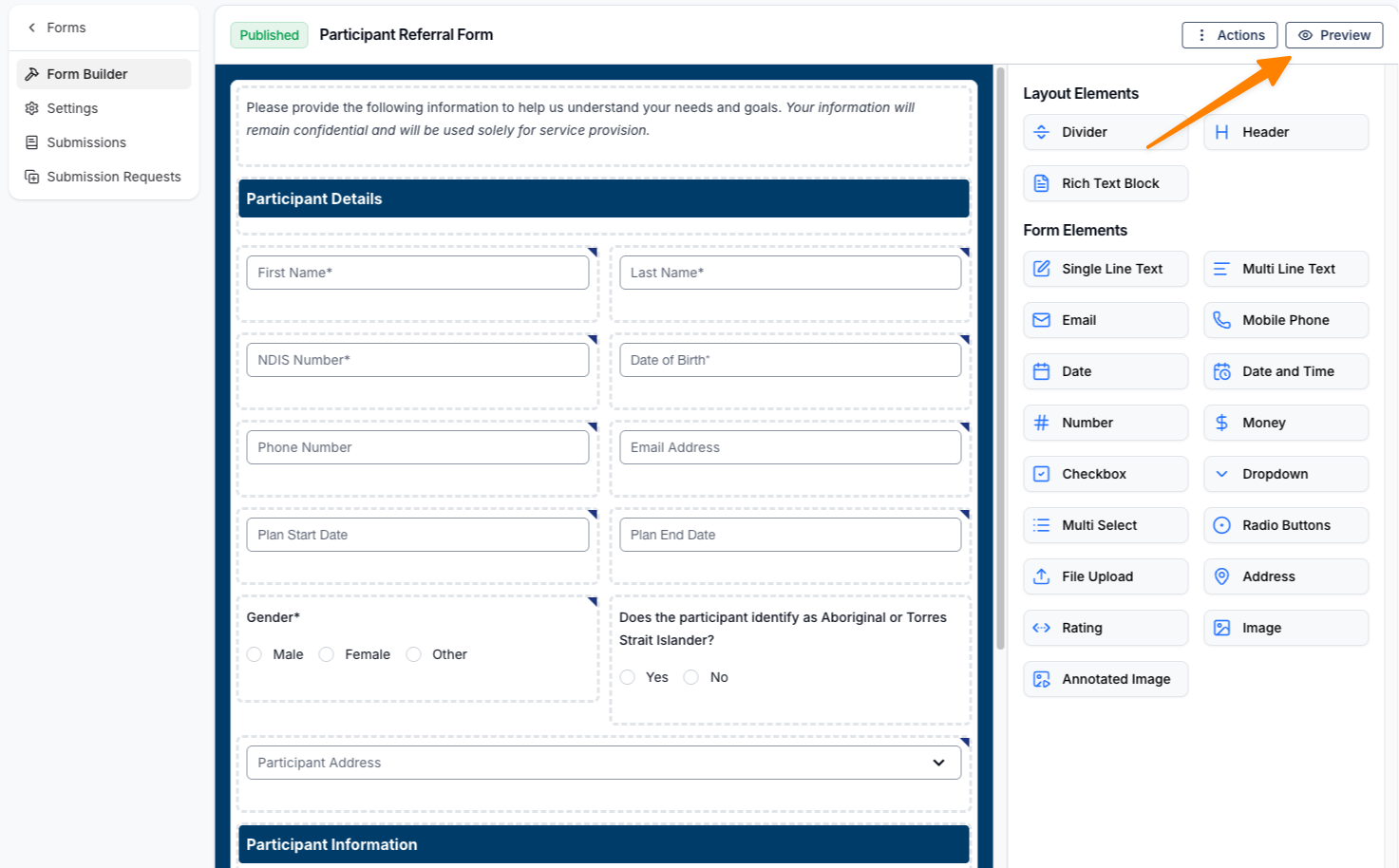
In the top-right corner of the screen, you’ll see two options: Actions and Preview. Under Actions, you can duplicate the form or copy a link to the published form. You also have the option to choose Get QR Code or Embed Form for sharing.
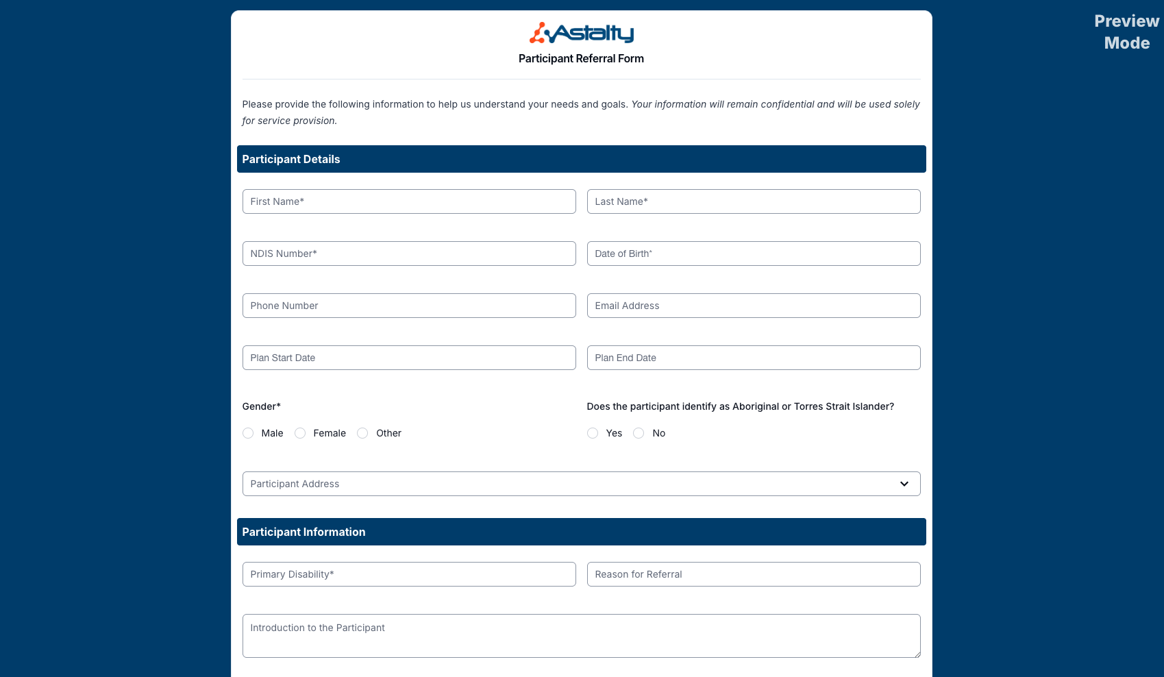
Selecting Preview will open a sample view of the form, showing exactly how it will appear to those completing it.
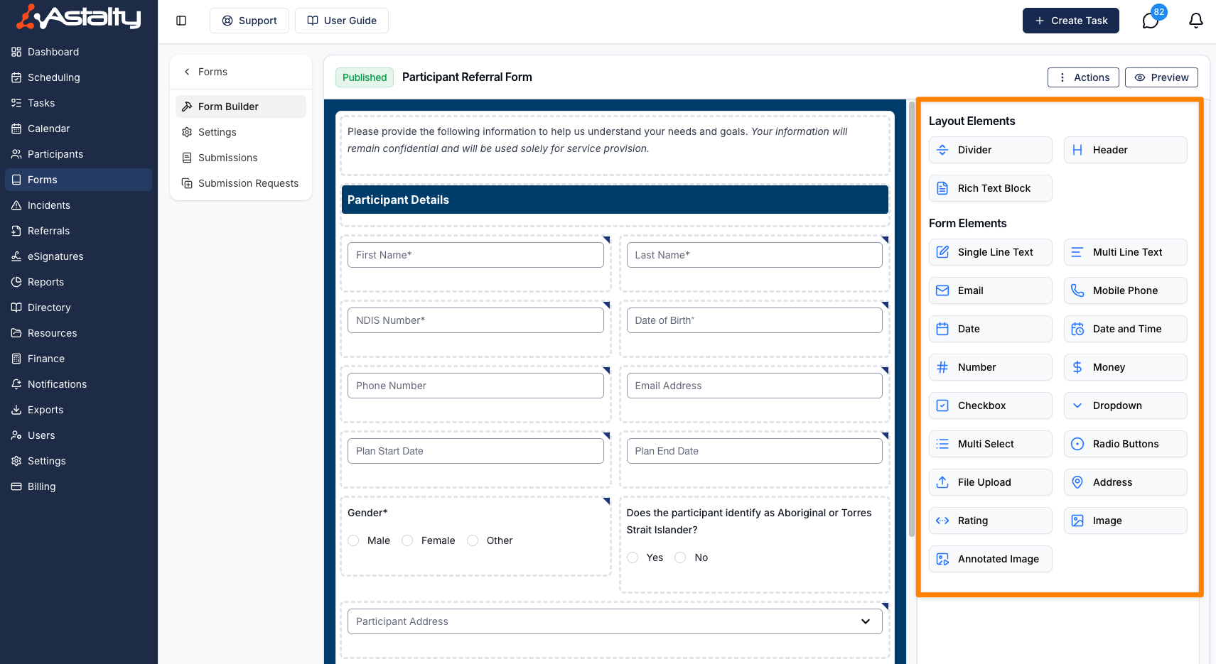
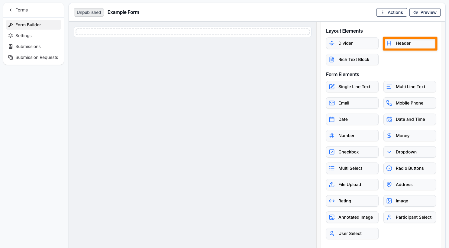
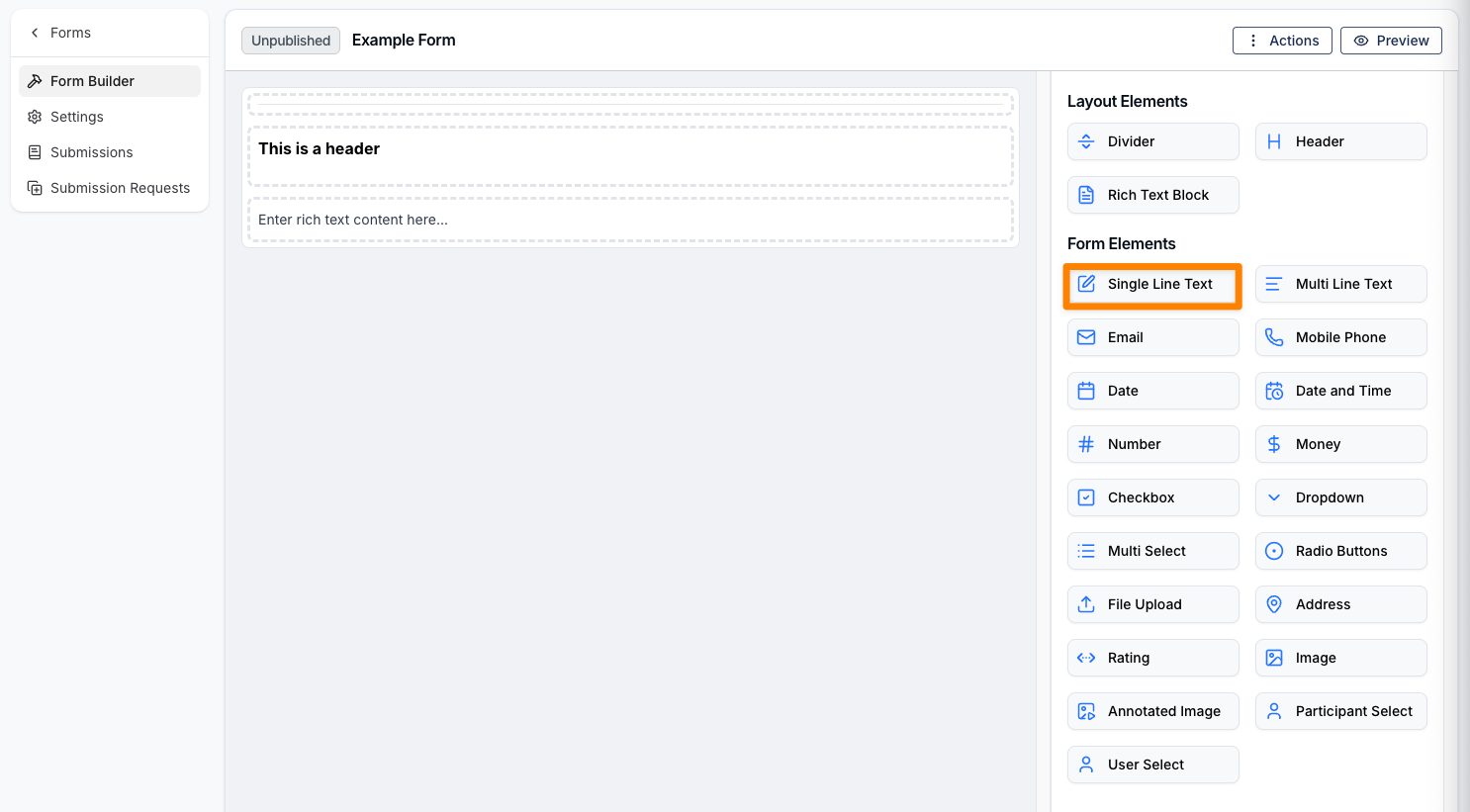
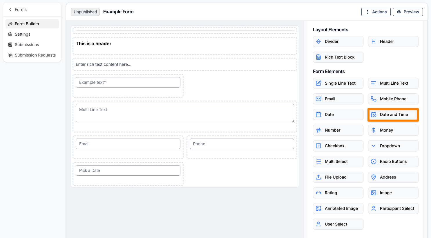
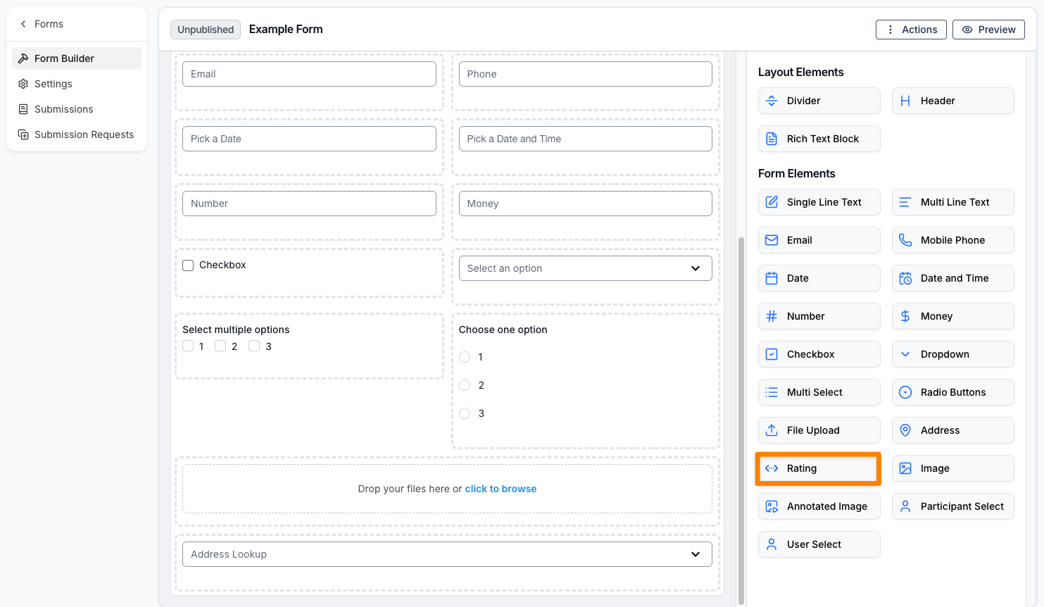
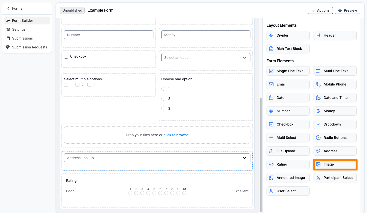
Below the buttons are the Form Elements, which are the fields you can drag into the form to build your content. These are divided into two categories: Layout Elements and Form Elements.
How to Build a Form
Simply select an element from the list to add it to your form. It will be placed beneath the last element in the Form Builder. Alternatively, you can drag and drop an element into the exact position you want it to appear. You can also click and drag existing elements within the Form Builder to rearrange them.
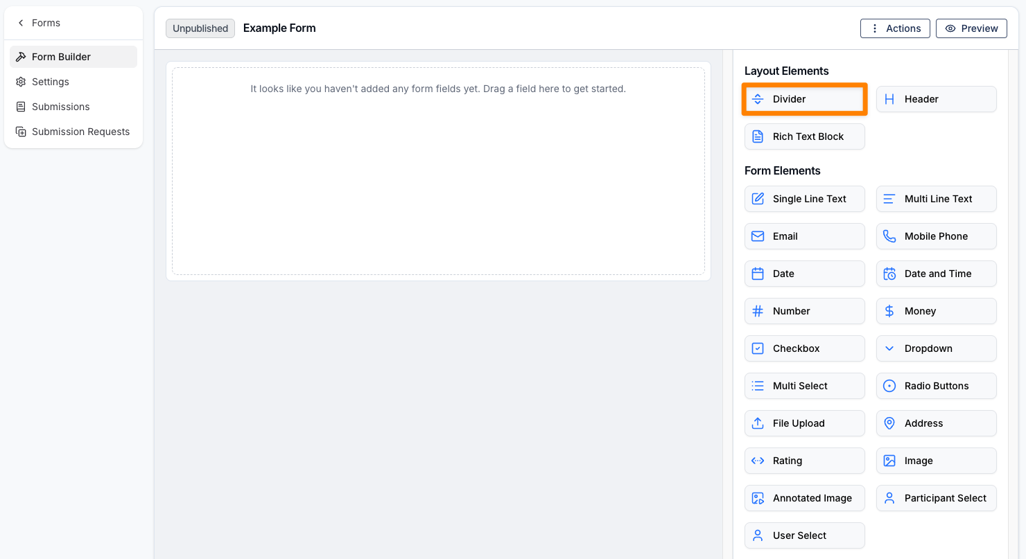
Layout Elements
Layout elements control the structure of your form and can also be used to display text within it. The available options are listed below.
To exit the element settings, click Close in the bottom-right corner of the Form Builder.
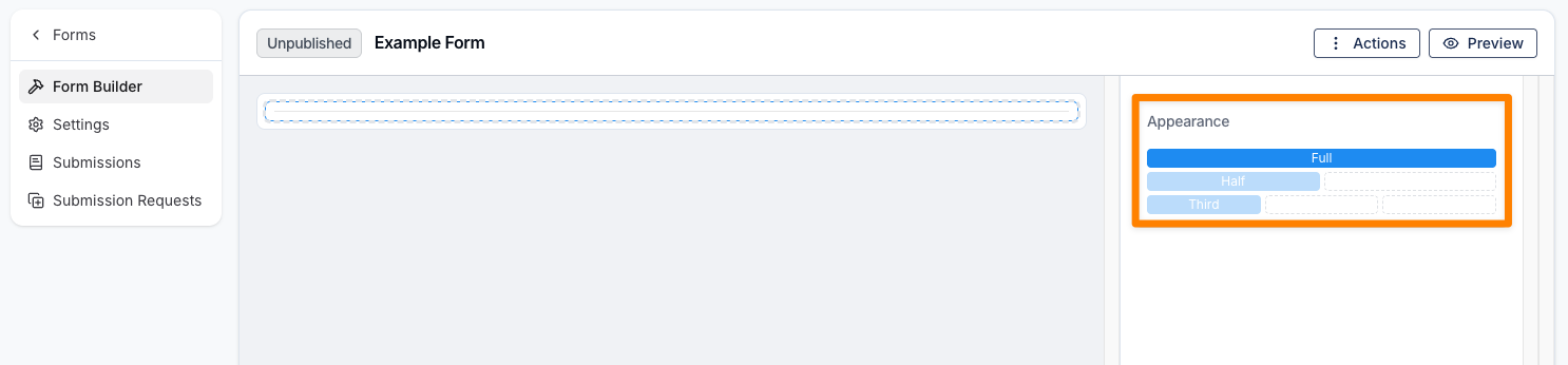
Divider
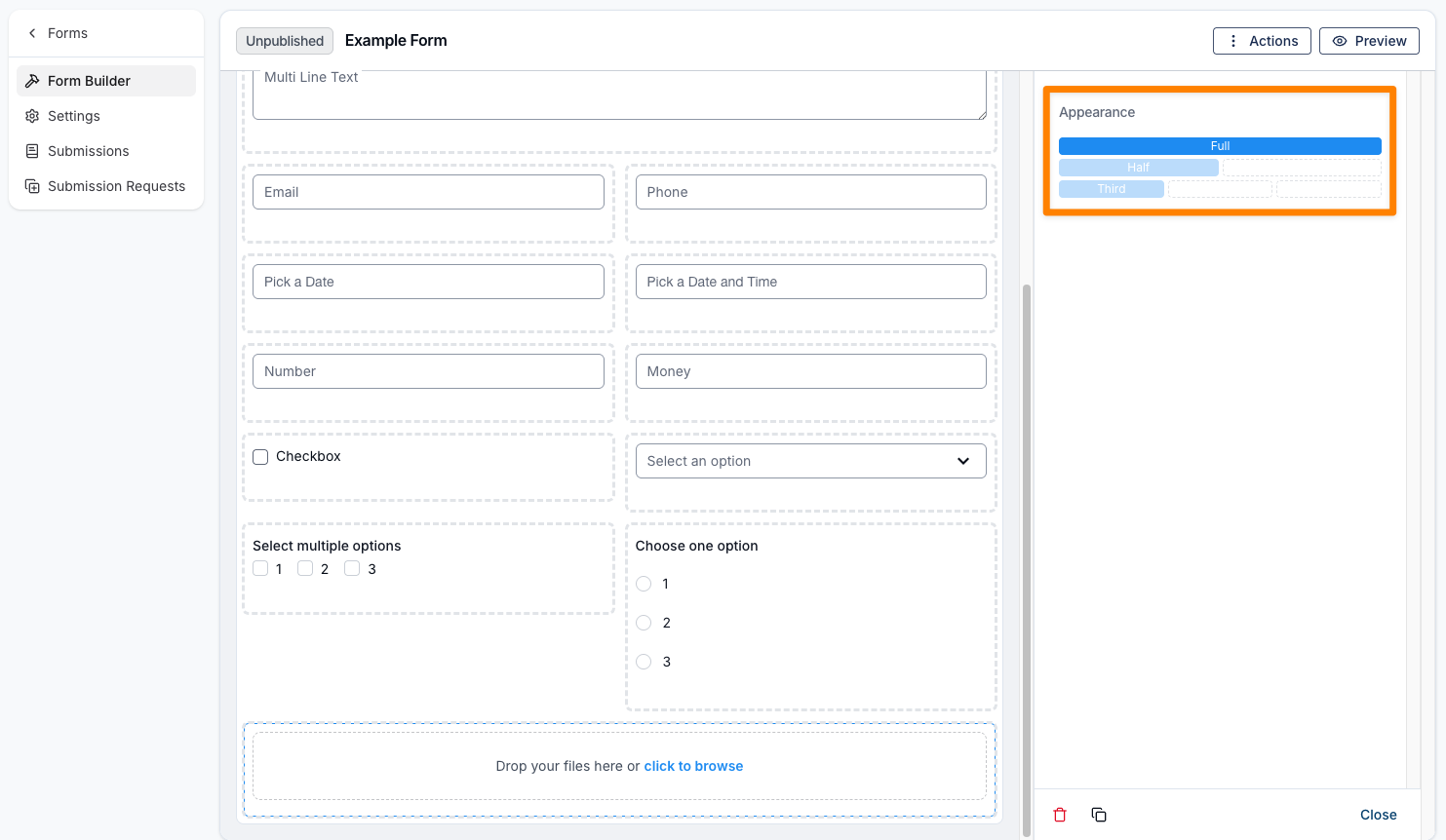
A Divider Element helps control the spacing and organisation of different sections within the form. You can customise its appearance, including the width of the divider, and choose from the following options:
- Full
- Half
- Third
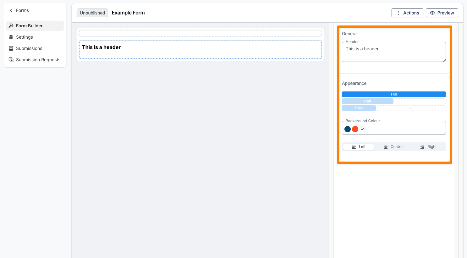
Header
A Header Element can be used as a title for a specific section of a form, especially when sections are separated by a Divider. You can customise the header text, as well as adjust its appearance—this includes the width, alignment, and background colour of the Header element.
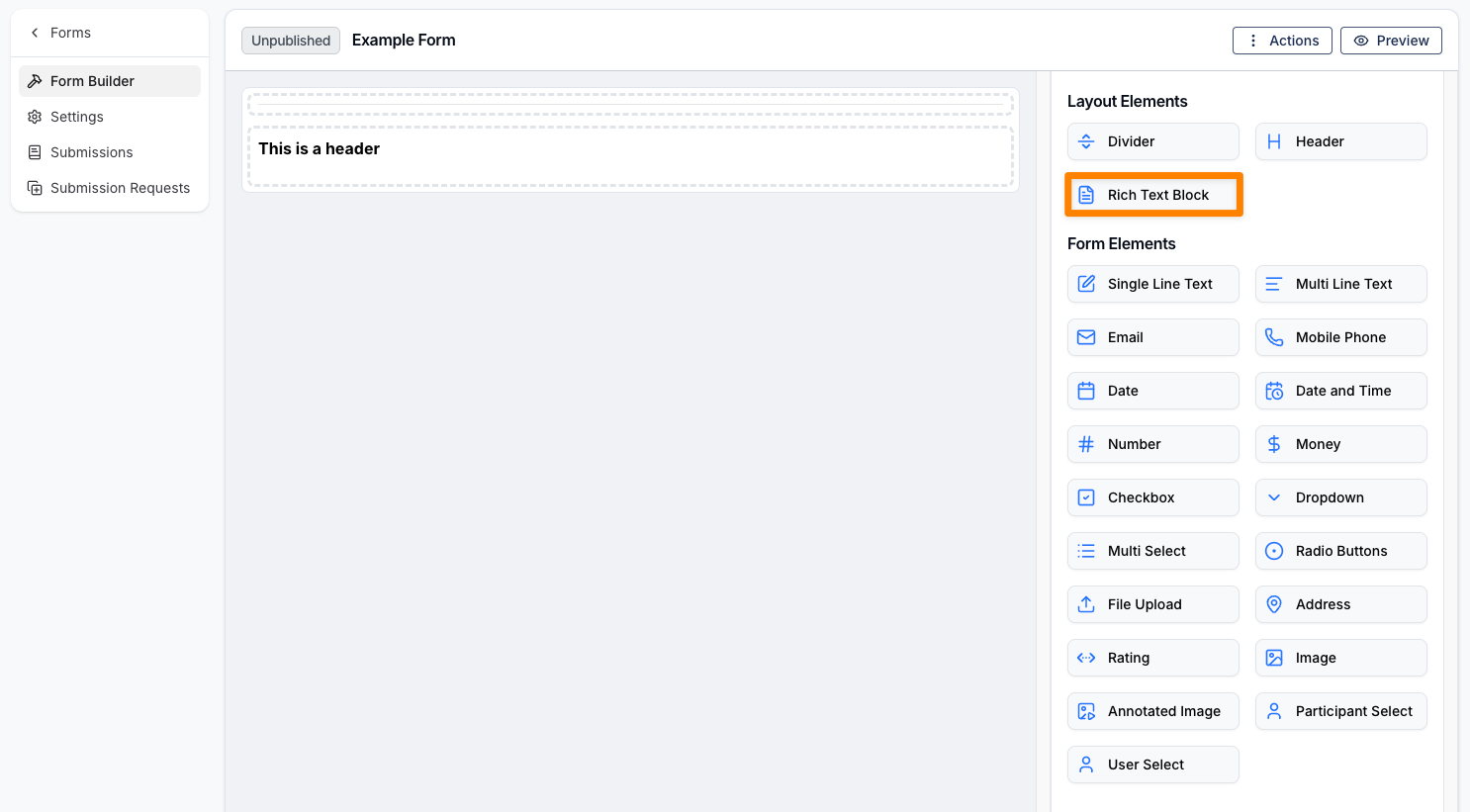
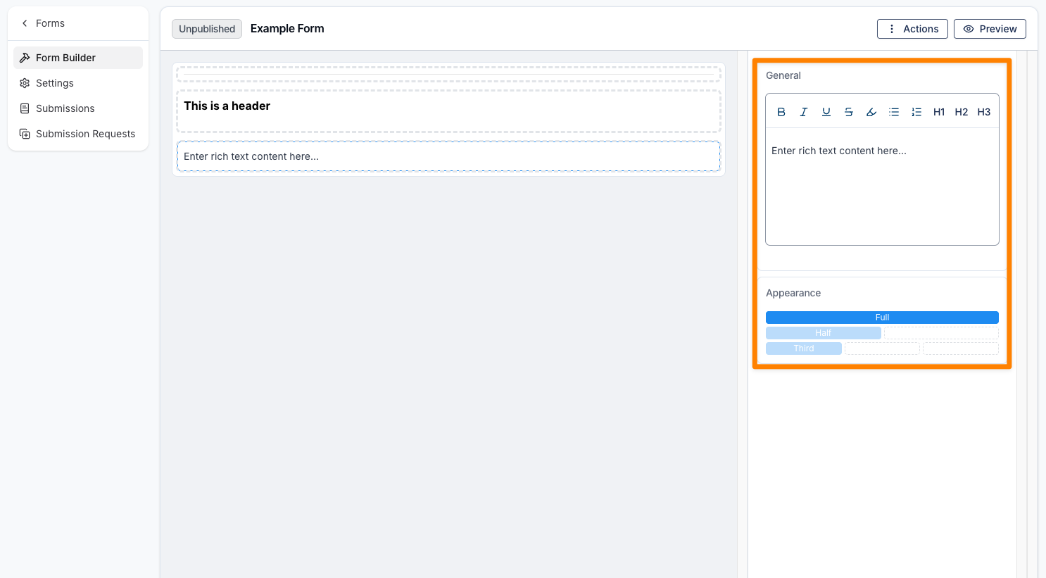
Rich Text Block
A Rich Text Block allows you to add text to the form for display purposes only. You can edit the displayed text and adjust the element’s appearance, including its width.
Form Elements
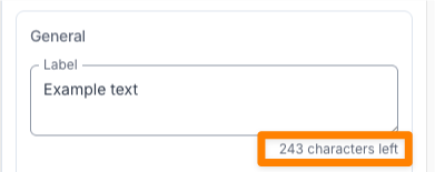
Are the fields that information can be entered against are under the Form Elements header. Many of the form elements contain a Label which is character restricted and provides a character count down.
The form element options available to you are:
Single Line Text
A Single Line Text field is used for short responses, such as a first name or last name. Like the layout elements, it includes options for a label and appearance. You’ll also see Placeholder and Required settings—when Required is selected, the field must be completed before the form can be submitted.
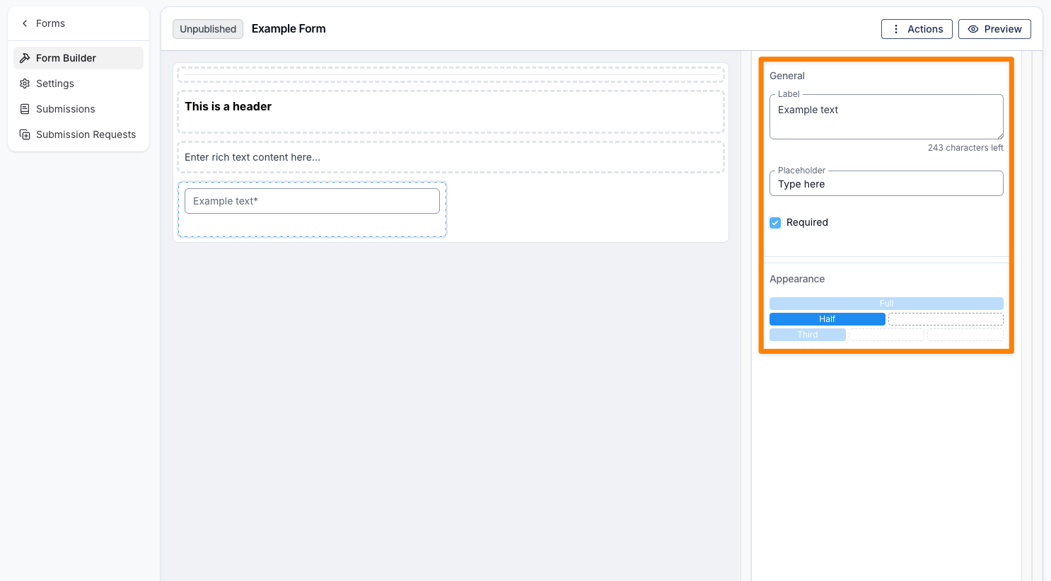
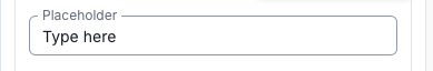
A Placeholder is the text that appears inside the textbox as a hint when it is selected; it is not the label of the textbox.
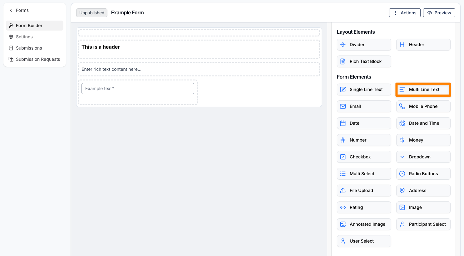
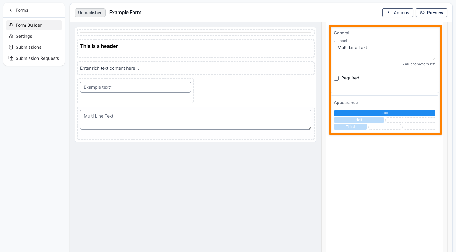
Multi Line Text
A Multi Line Text field is used for longer responses. Like the layout elements, it includes options for a label and appearance, along with a Required checkbox.
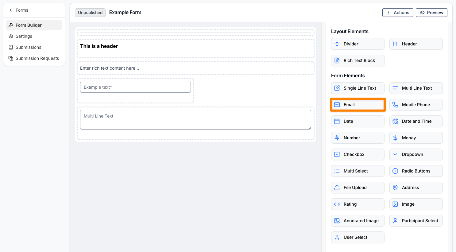
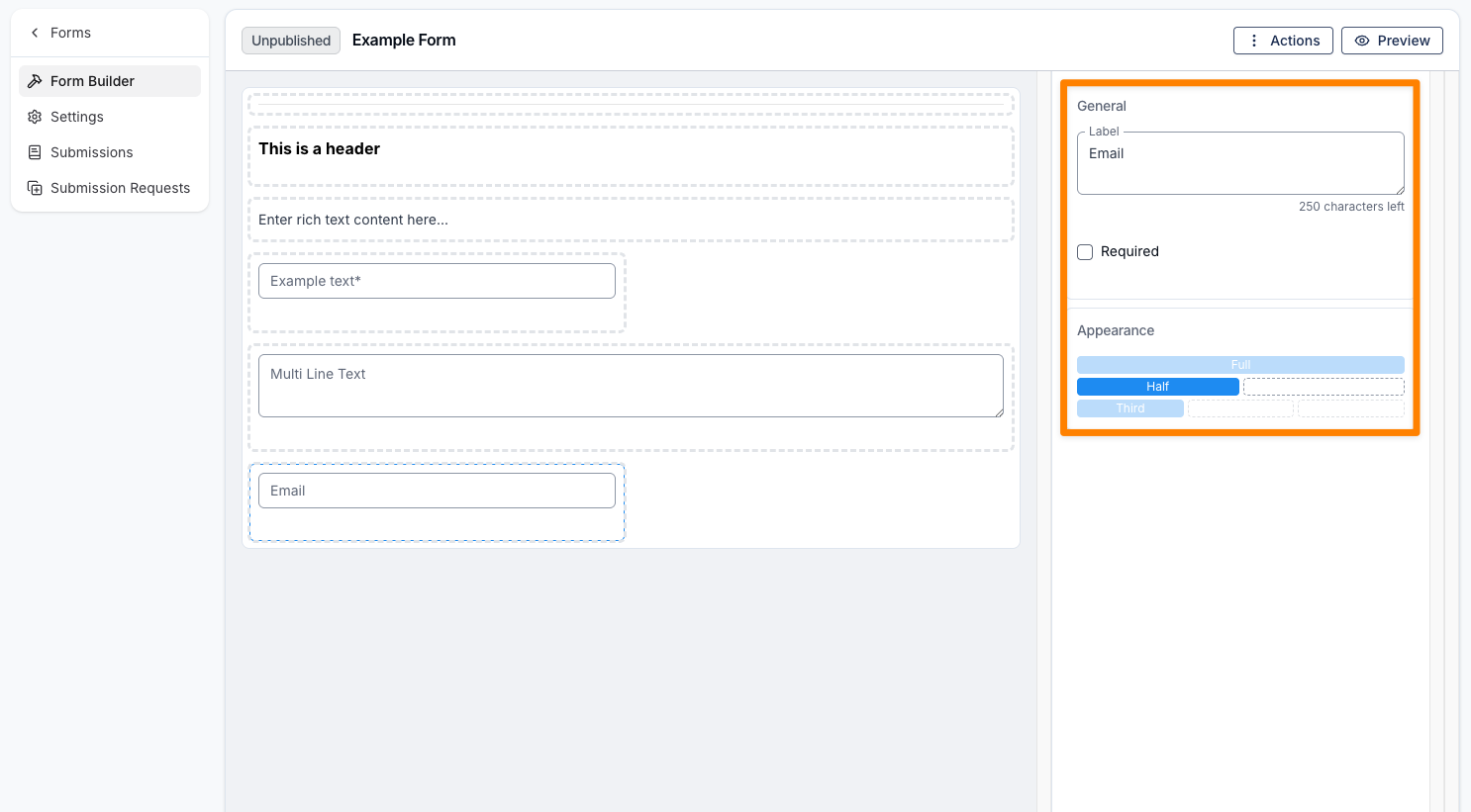
Email Address
An Email Address field is used to capture email addresses. Like the layout elements, it includes options for a label and appearance, along with a Required checkbox.
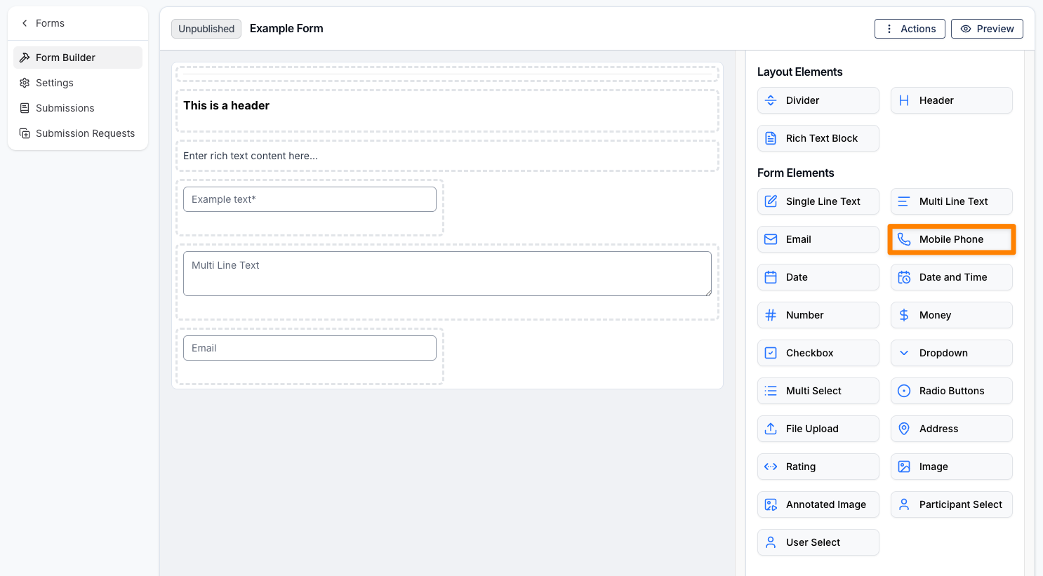
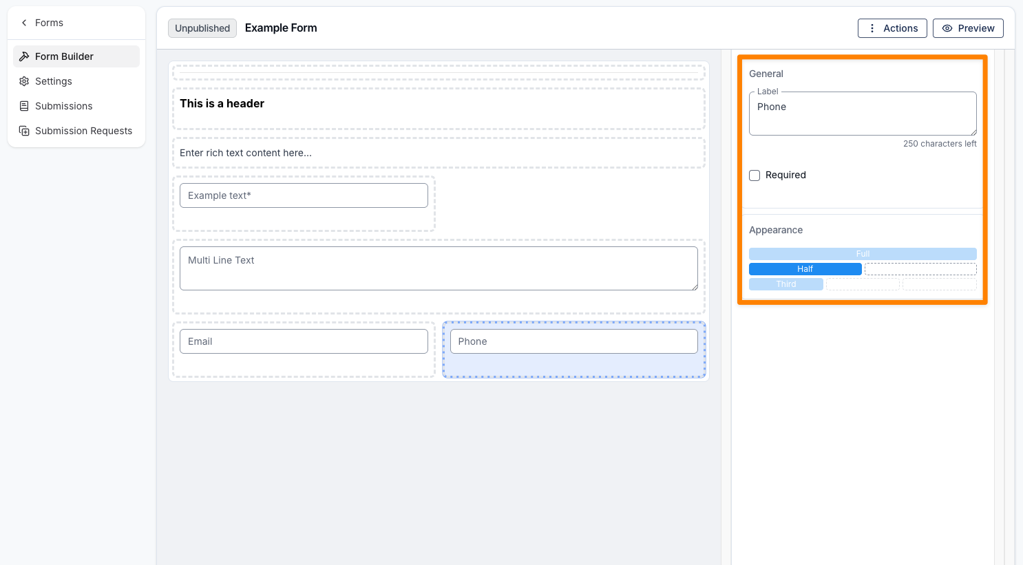
Mobile Phone Number
A Mobile Phone Number field is used to capture mobile phone numbers. Like the layout elements, it includes options for a label and appearance, along with a Required checkbox.
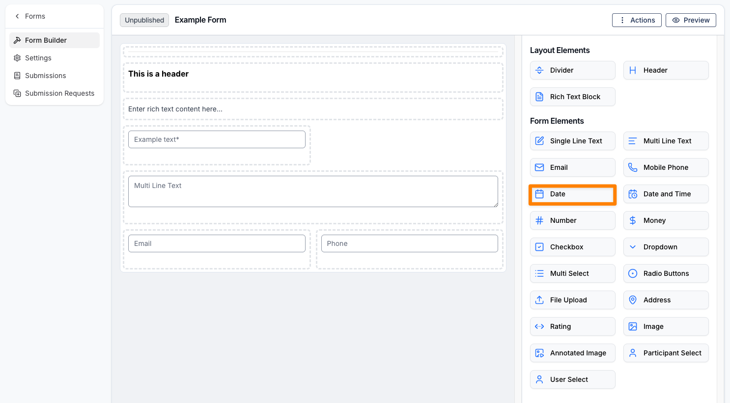
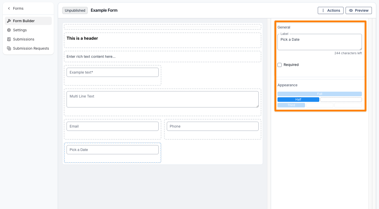
Date Picker
A Date Picker field allows users to select a date. When the field is clicked, a calendar will appear for easy selection, or a date can be entered manually into the field. Like the layout elements, it includes options for a label and appearance, along with a Required checkbox.
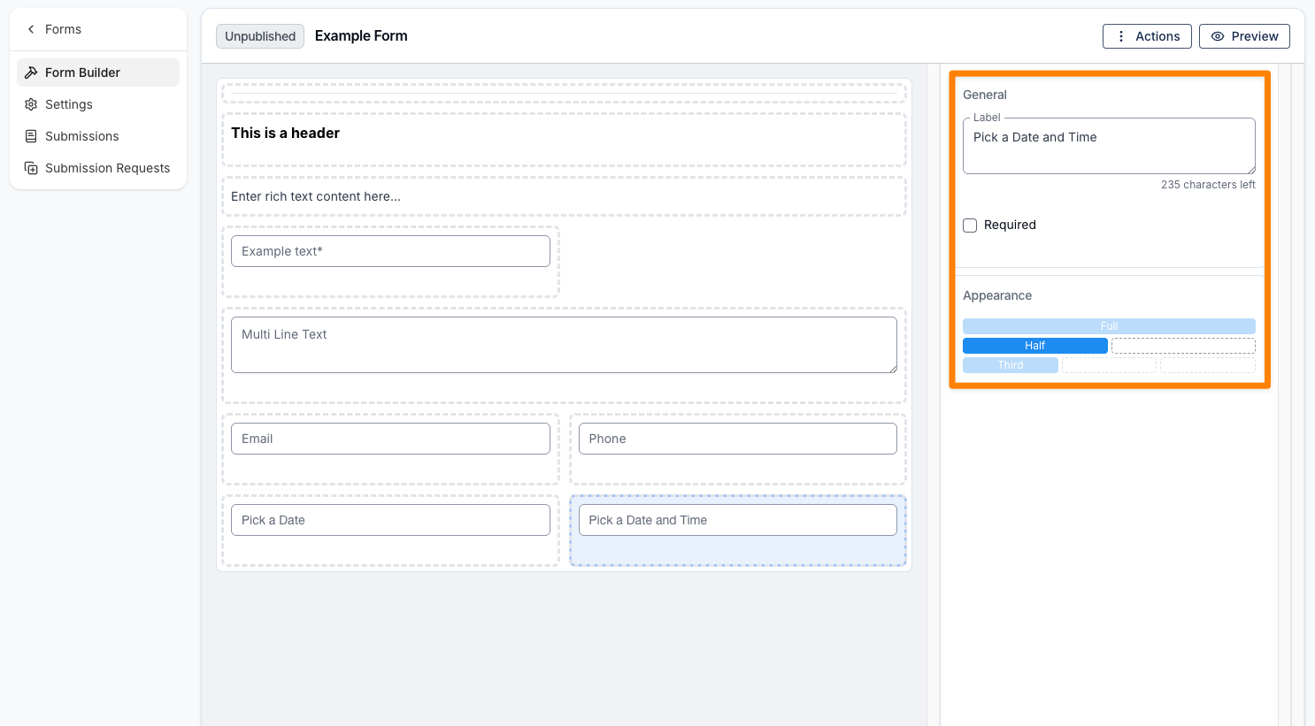
Date and Time Picker
A Date and Time Picker field allows users to select both a date and time. When the field is clicked, a calendar will appear, enabling selection of a specified date and time directly within the form. Like the layout elements, it includes options for a label and appearance, along with a Required checkbox.
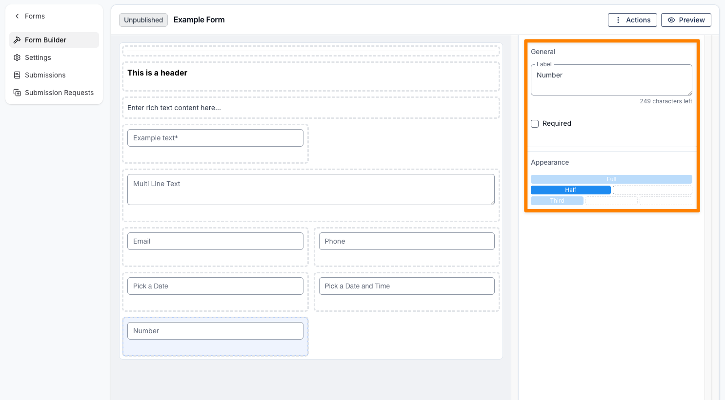
Number
A Number field is used to capture numeric values, such as a Participant’s NDIS number. Like the layout elements, it includes options for a label and appearance, along with a Required checkbox.
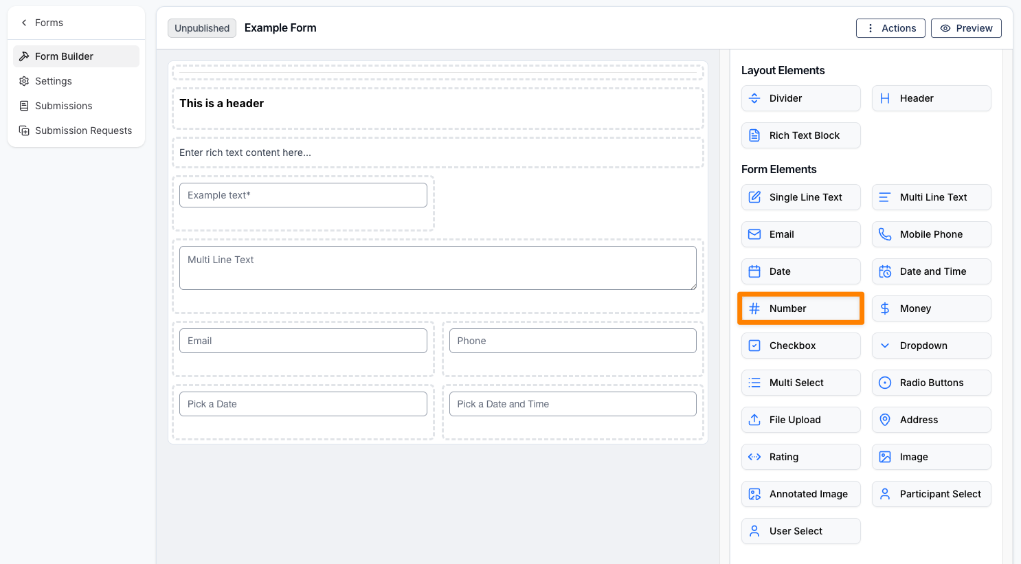
Number fields keep decimal values. In the Appearance section you can set a Decimal places limit (0–6) to control how many digits are allowed after the decimal point—leave it blank to allow any number of decimal places.
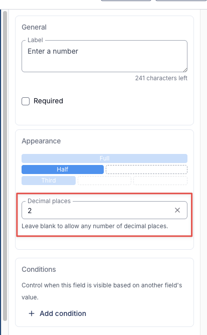
If someone completing the form enters more decimals than the limit allows, they’ll see a validation message (for example, This field allows a maximum of 2 decimal places.) and the value won’t be saved until it’s corrected. Setting the limit to 0 restricts the field to whole numbers only.
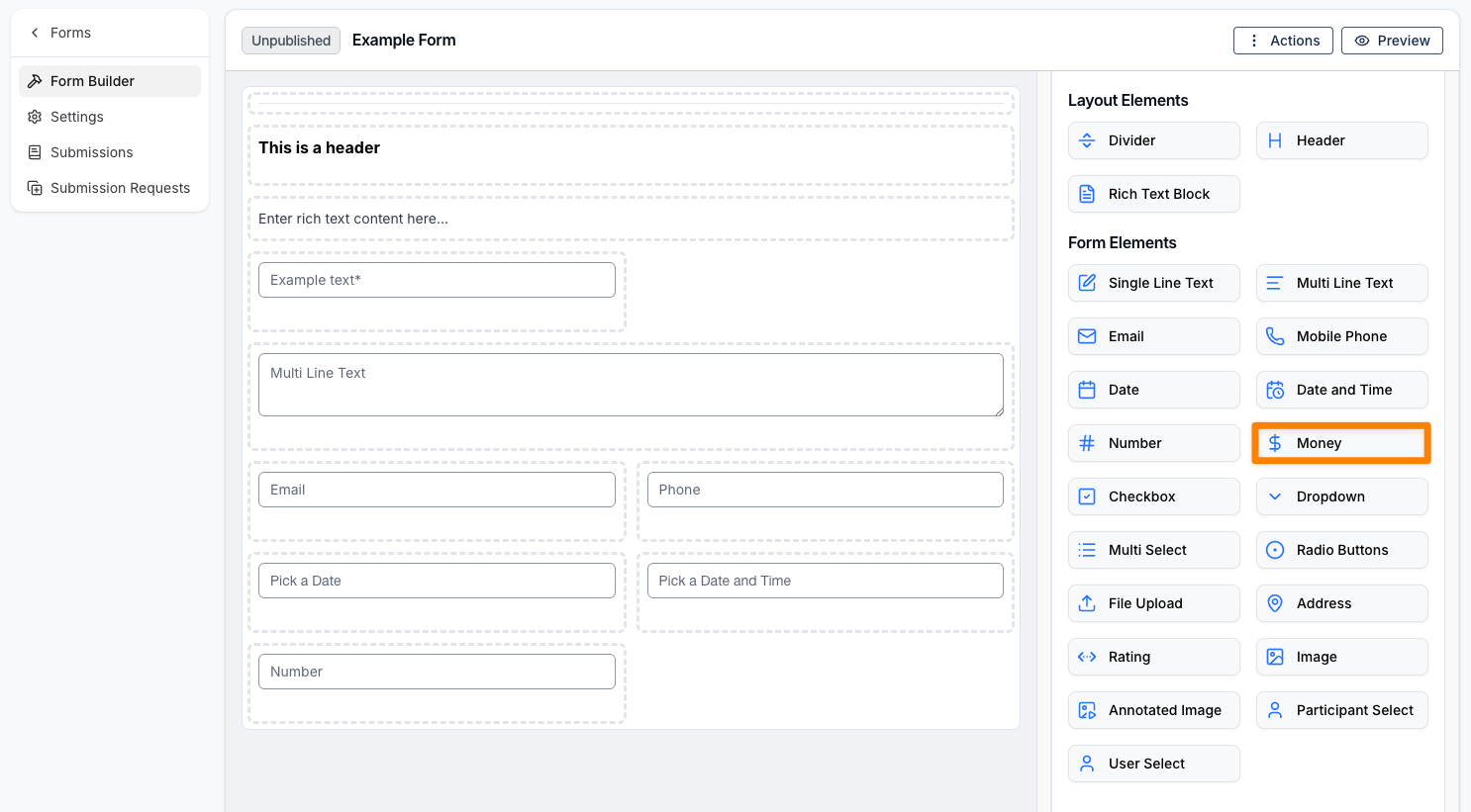
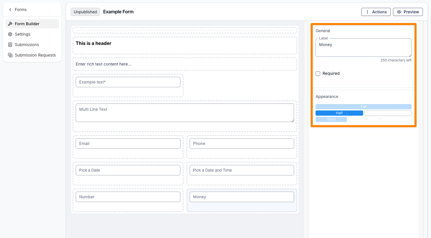
Money
A Money field is used to capture monetary values, such as the budget available for part or all of a Participant’s NDIS plan. Like the layout elements, it includes options for a label and appearance, along with a Required checkbox.
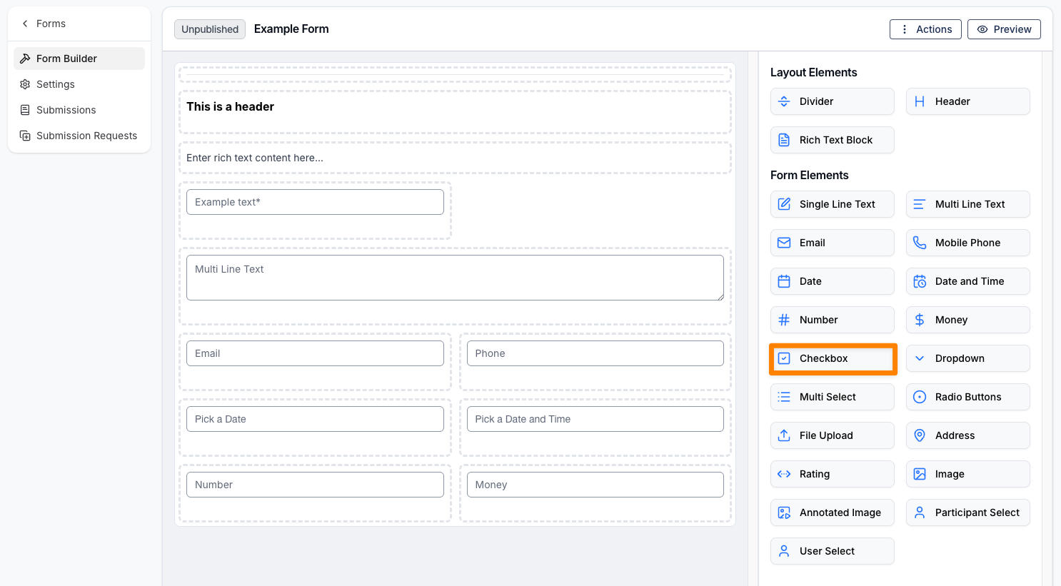
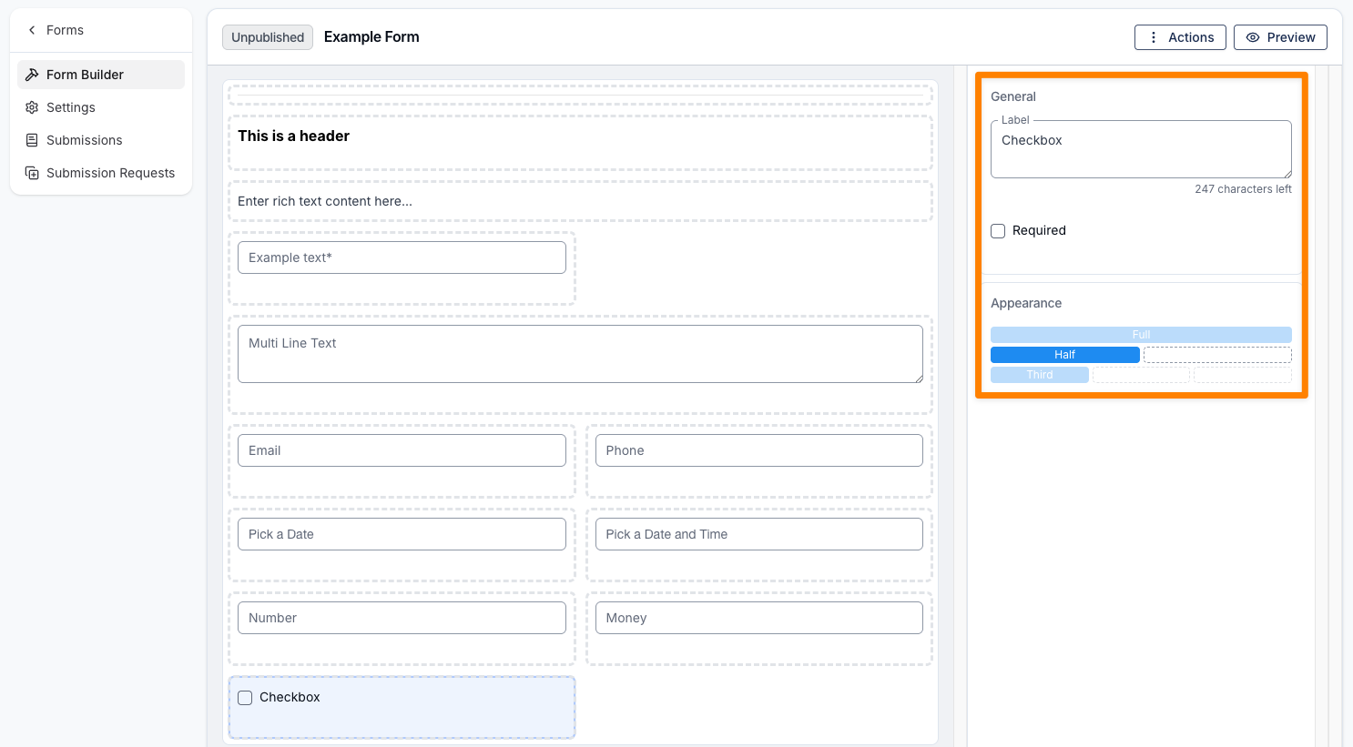
Checkbox
A Checkbox field allows you to add a selectable option to the form. Like the layout elements, it includes options for a label and appearance, along with a Required checkbox.
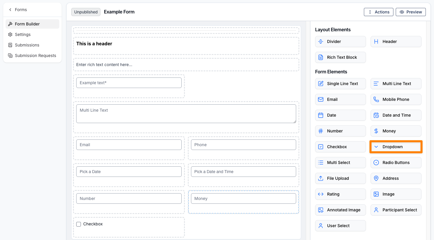
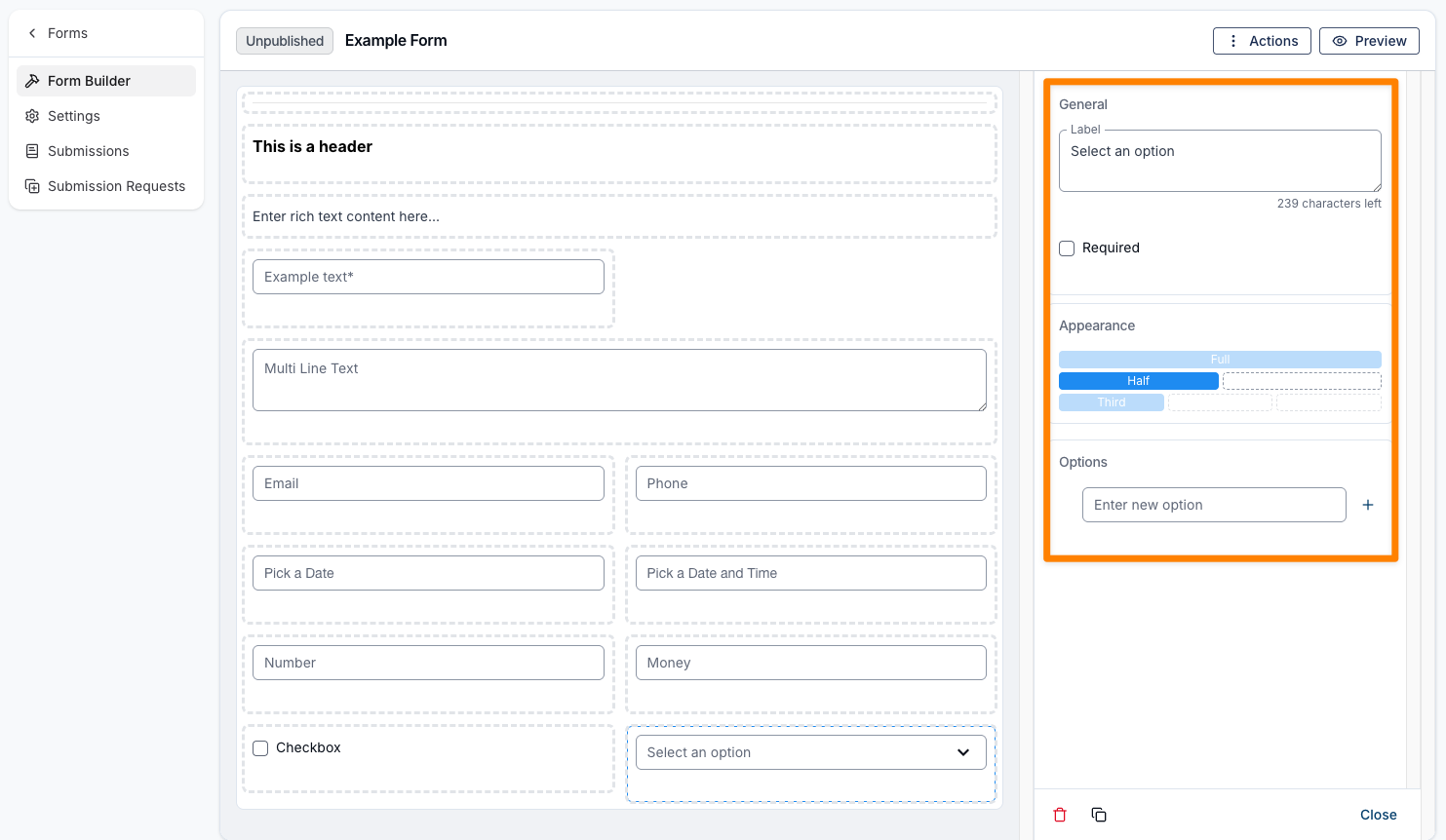
Dropdown
A Dropdown field allows you to add a dropdown menu to the form. Like the layout elements, it includes options for a label and appearance, along with a Required checkbox. You can also add multiple options to the dropdown and assign a name to each option.
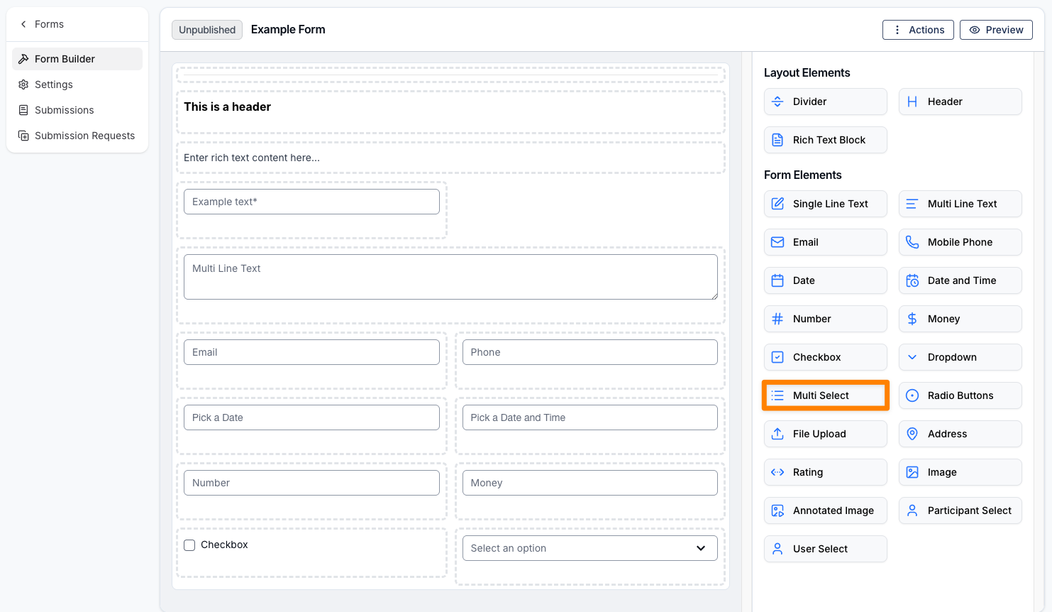
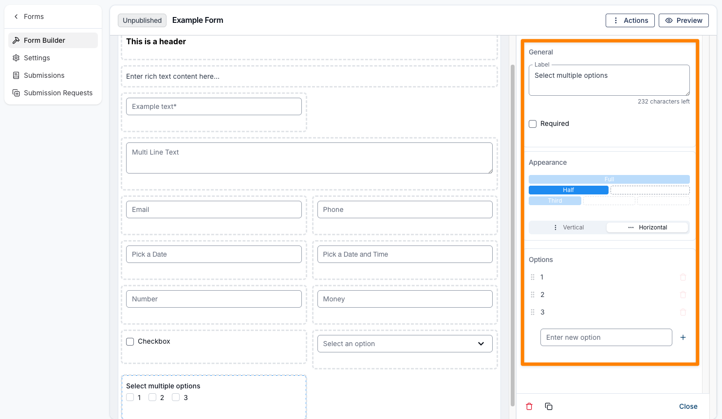
Multi Select
A Multi Select field allows you to add multiple selectable options to the form using checkboxes. Like the layout elements, it includes options for a label and appearance, along with a Required checkbox. You can also choose how the options are displayed—either horizontally or vertically—and add multiple options, each with its own name.
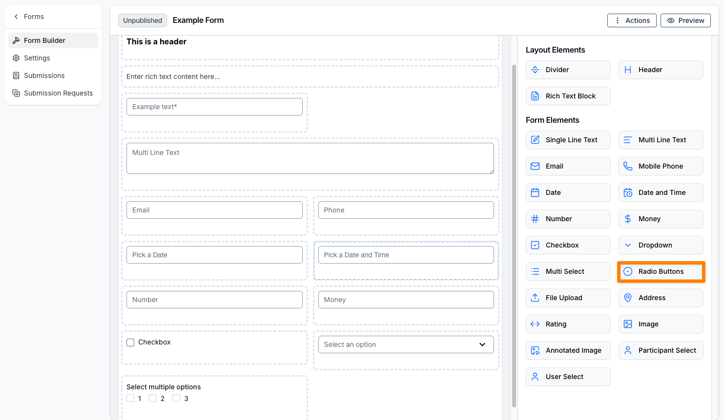
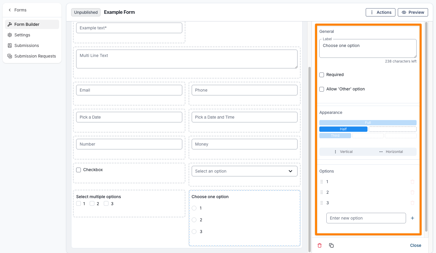
Radio Buttons
Radio Buttons are used to add multiple selectable options to the form, where only one option can be selected at a time. Like the layout elements, they include options for a label and appearance, along with a Required checkbox. You can also choose how the options are displayed—either horizontally or vertically—and add multiple options, each with its own name.
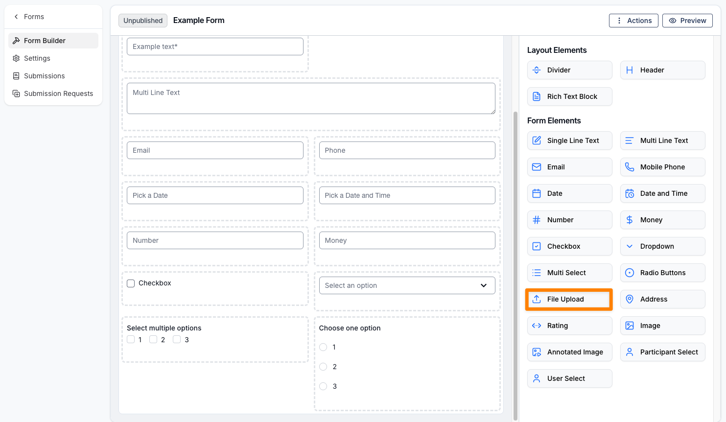
File Upload
A File Upload field allows users to attach and submit documents through the form, such as a Participant’s NDIS plan or relevant reports. You will be able to adjust the width of this fielder to either, full, half, or third.
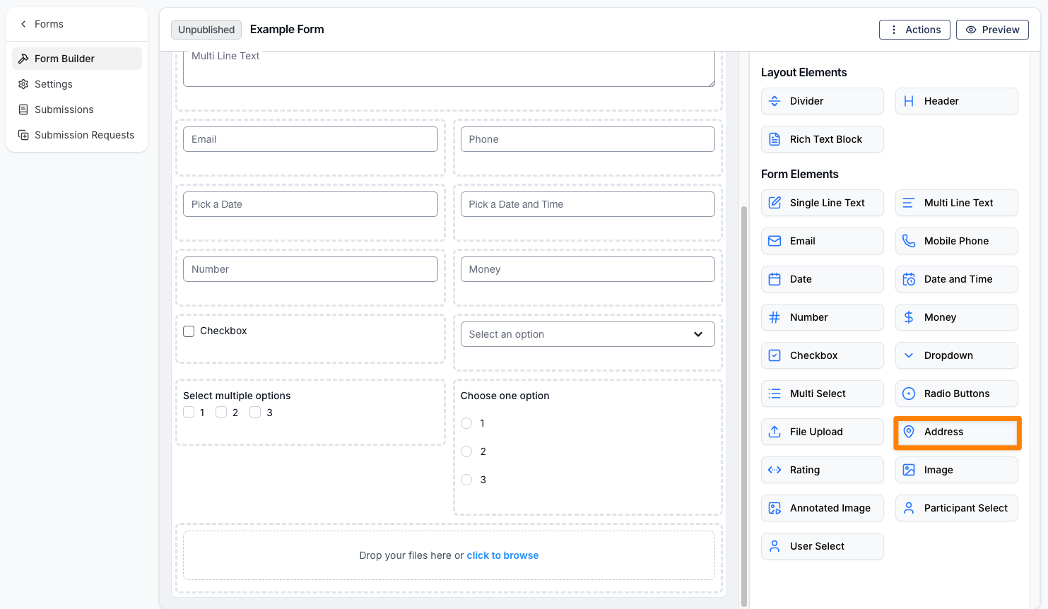
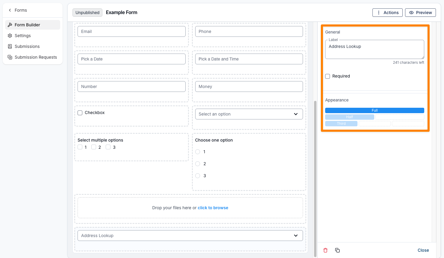
Address
An Address field allows users to enter their address using an Address Lookup feature. This enables selection from pre-defined addresses, similar to what you’ll find on many websites. Like the layout elements, it includes options for a label and appearance, along with a Required checkbox. It may also be helpful to include a Single Line Text field after this, in case the address is not available in the lookup.
Rating
A Rating field allows you to capture feedback such as customer satisfaction or pain scales. You can choose between numeric or star-based ratings, add a left label (e.g. Poor) and a right label (e.g. Excellent), and define the number of selectable options. Like the layout elements, it includes options for a label and appearance, along with a Required checkbox.
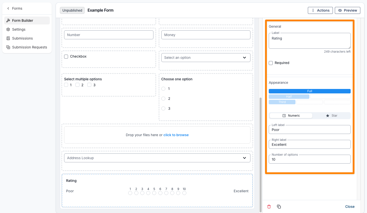
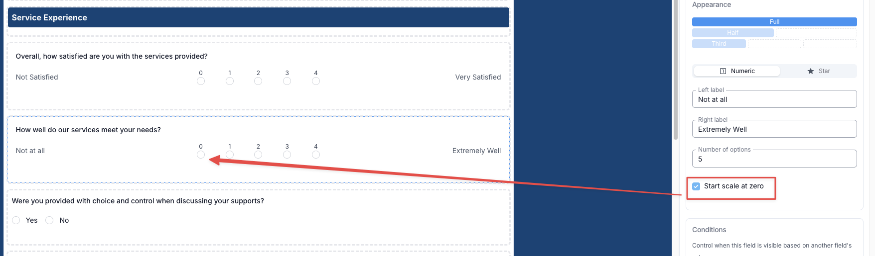
For numeric ratings, you can tick Start scale at zero in the field settings to begin the scale at 0 instead of 1—so a five-point scale runs 0, 1, 2, 3, 4 rather than 1, 2, 3, 4, 5. Number of options still sets how many points the scale has; starting at zero simply shifts the values down rather than adding another point. This option applies to numeric ratings only (star ratings are unchanged), and existing forms keep starting at 1 unless you turn it on.
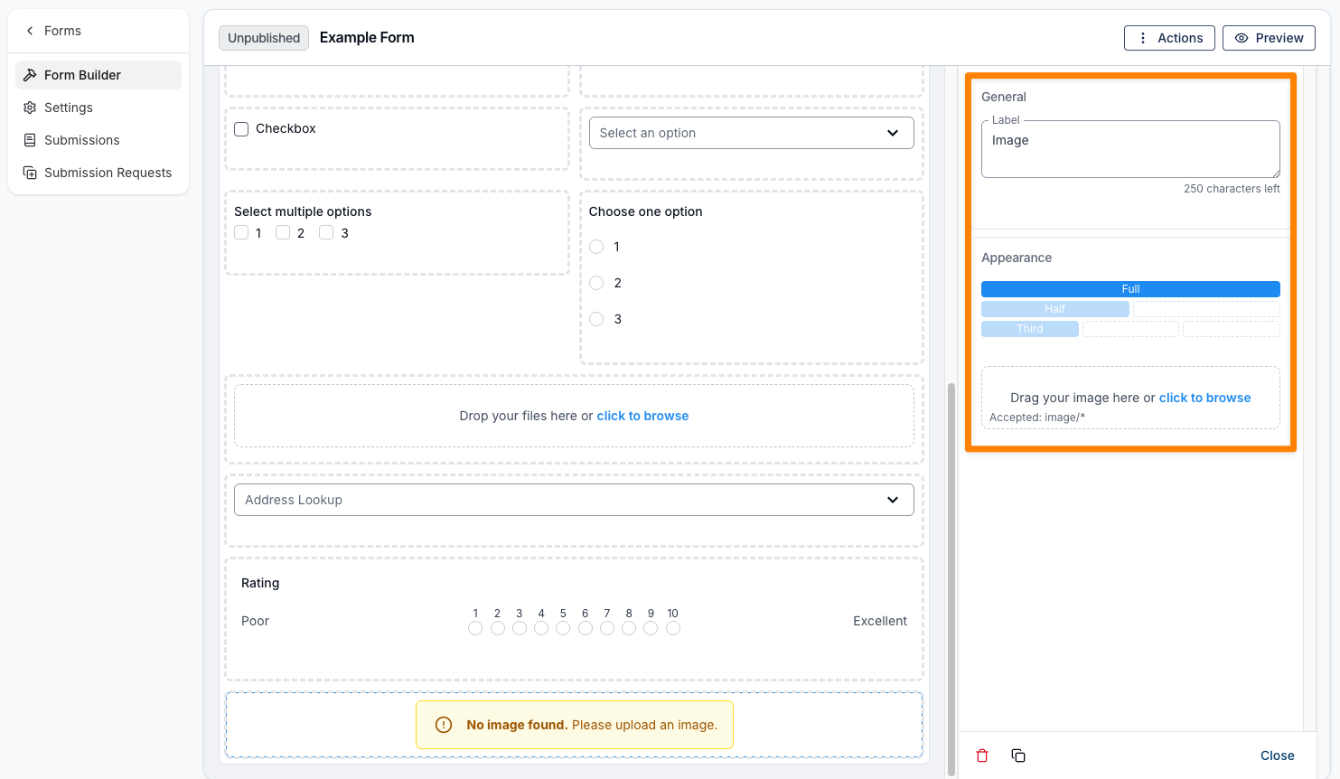
Image
An Image field allows you to add images to the form, such as logos, banners, or instructional visuals. This field does not require any input from the recipient. Like the layout elements, it includes a label option and allows you to adjust the appearance, including setting the width to full, half, or third.
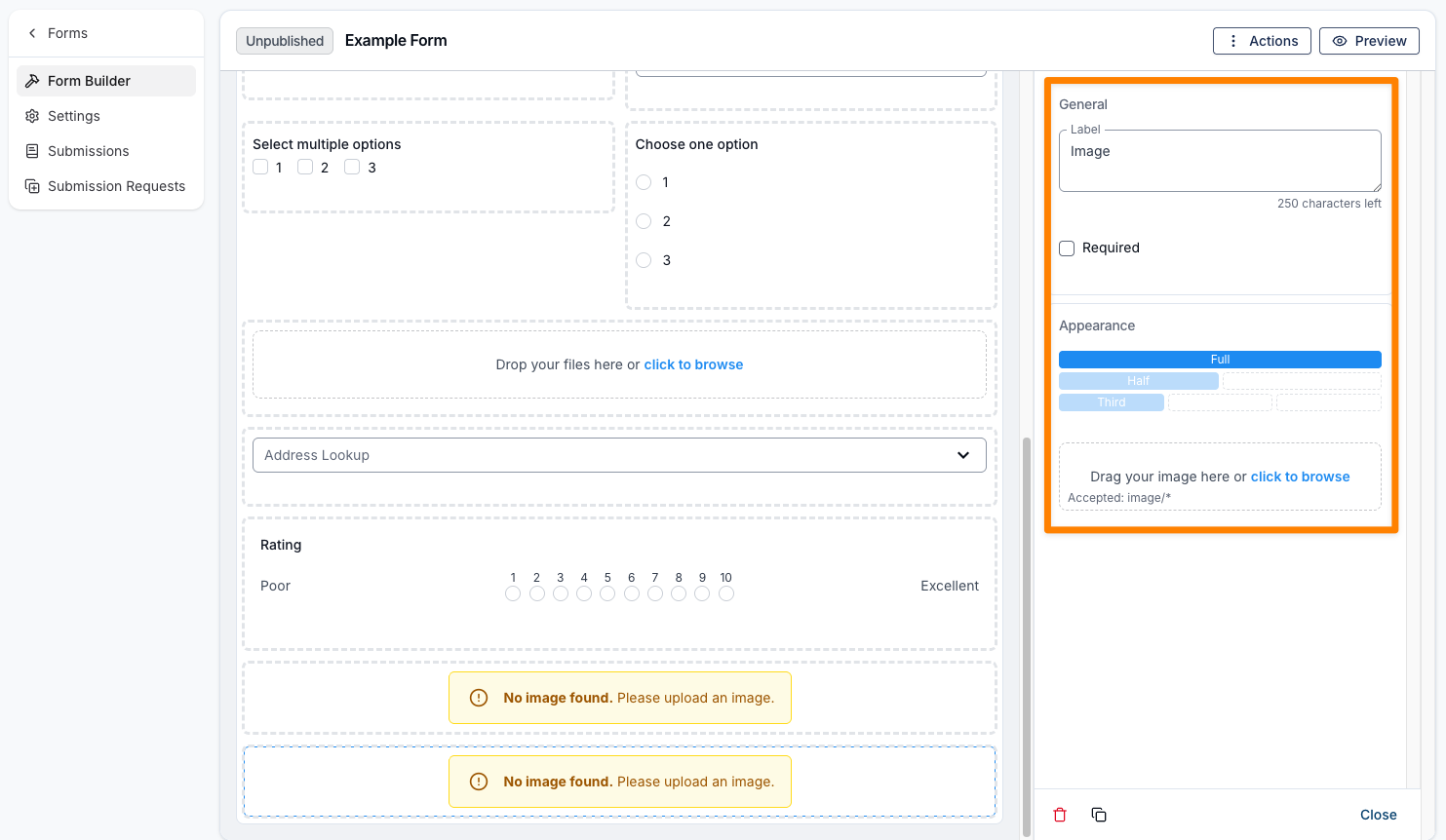
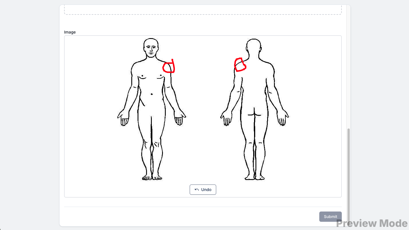
Annotated Image
An Annotated Image field allows you to upload an image to the form that can be marked up or annotated by the person completing it. Like the layout elements, it includes options for a label and appearance, along with a Required checkbox. You’ll also need to upload the image file so it can be displayed within the form.
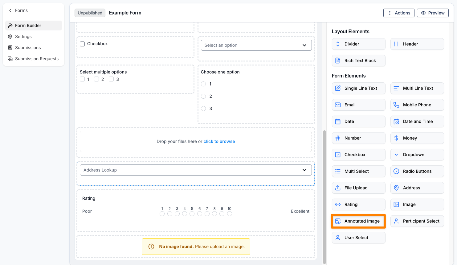
Here is an example of this in use.
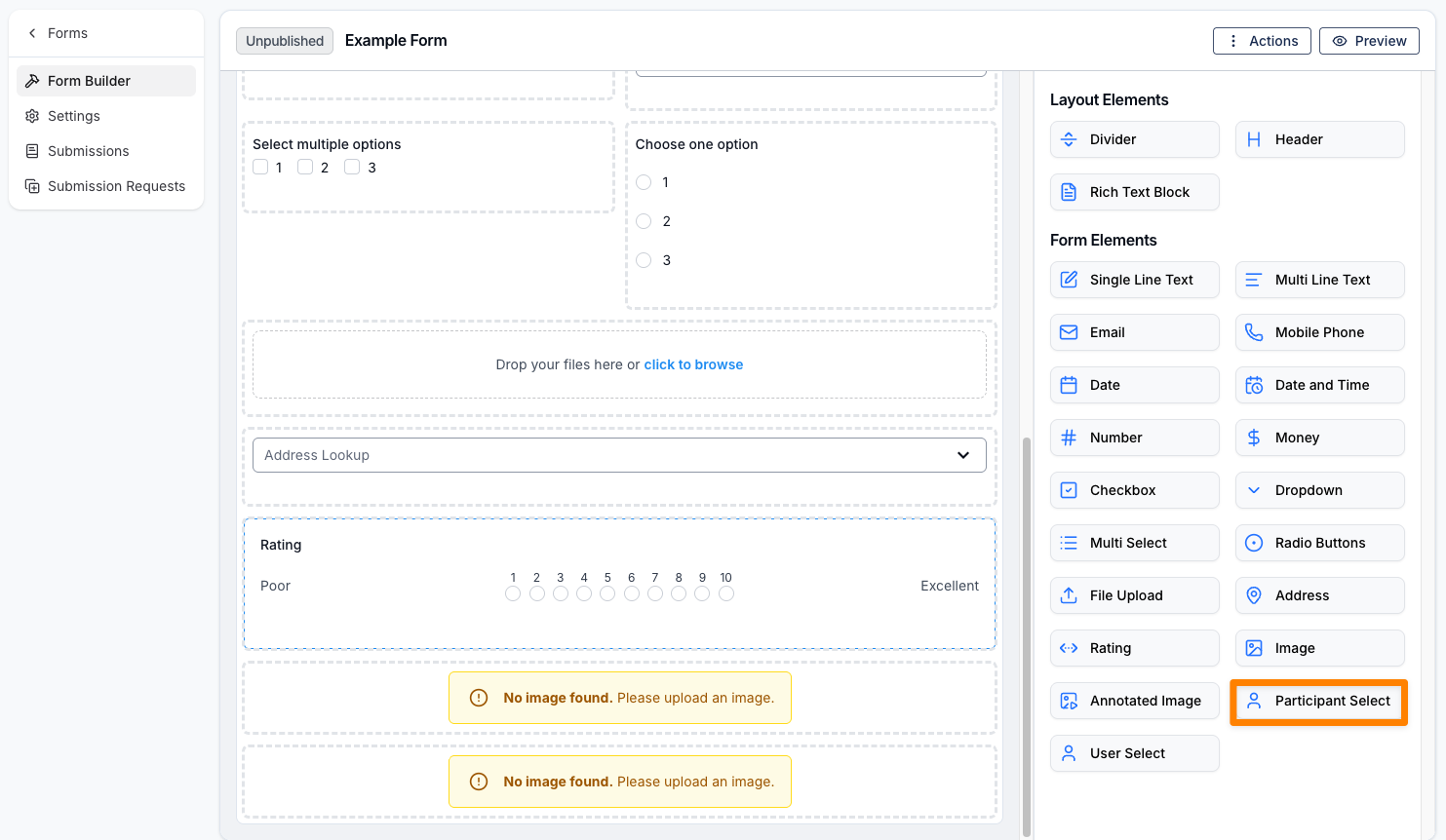
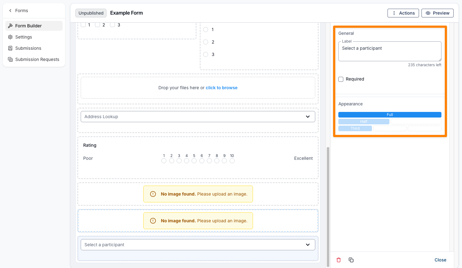
Participant Select
A Participant Select field allows you to add a dropdown menu to your form for selecting a Participant. This option is only available for internal form types. Like the layout elements, it includes options for a label and appearance, along with a Required checkbox.
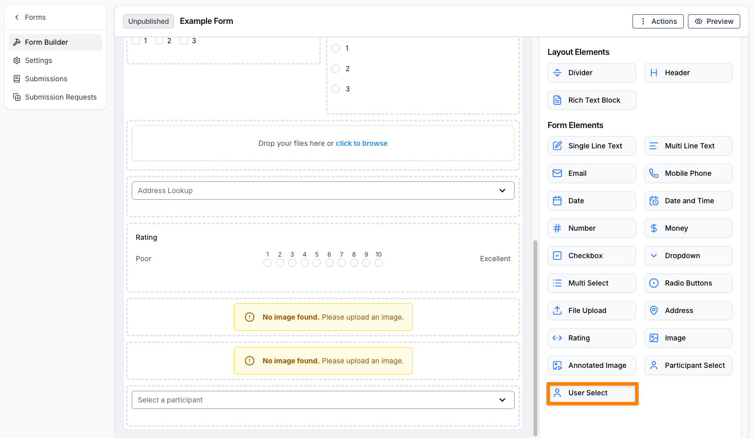
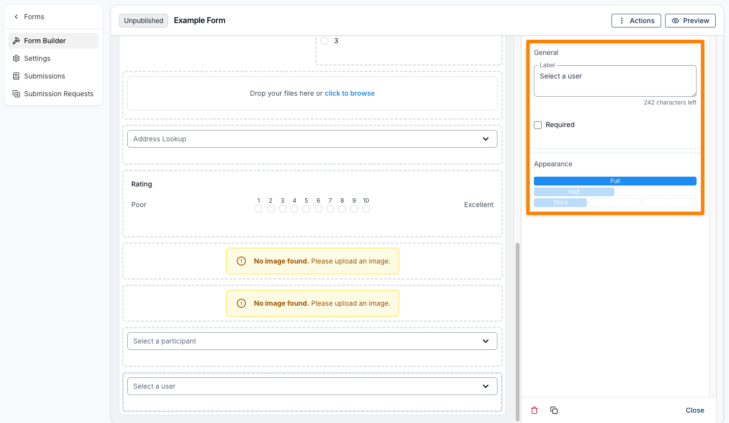
User Select
A User Select field allows you to add a dropdown menu to your form for selecting a user. This option is only available for internal form types. Like the layout elements, it includes options for a label and appearance, along with a Required checkbox.
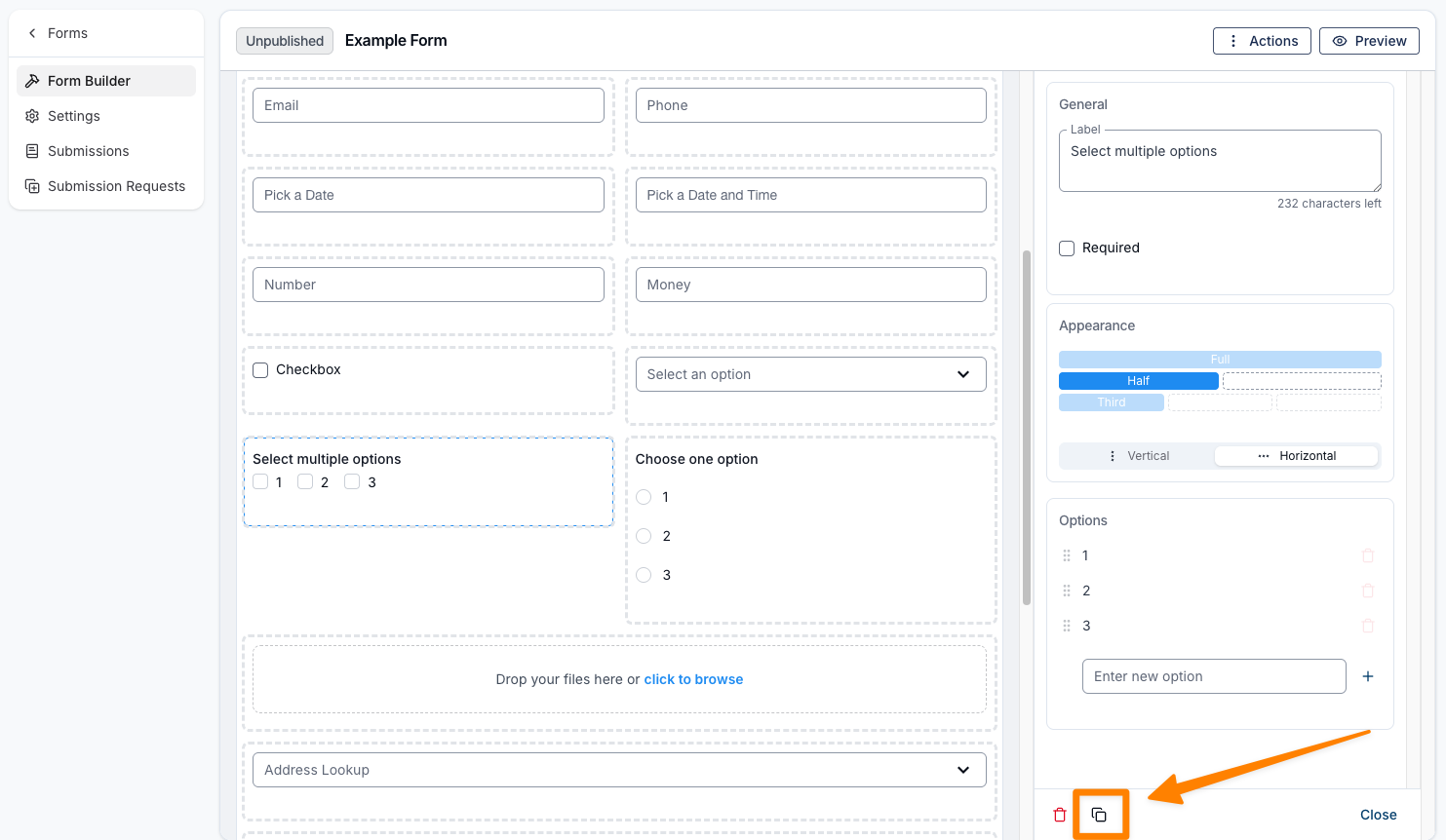
Duplicating a Field
There may be times when you need to duplicate a form field, such as when requesting multiple days and times for supports or capturing repeated written responses with similar placeholders.
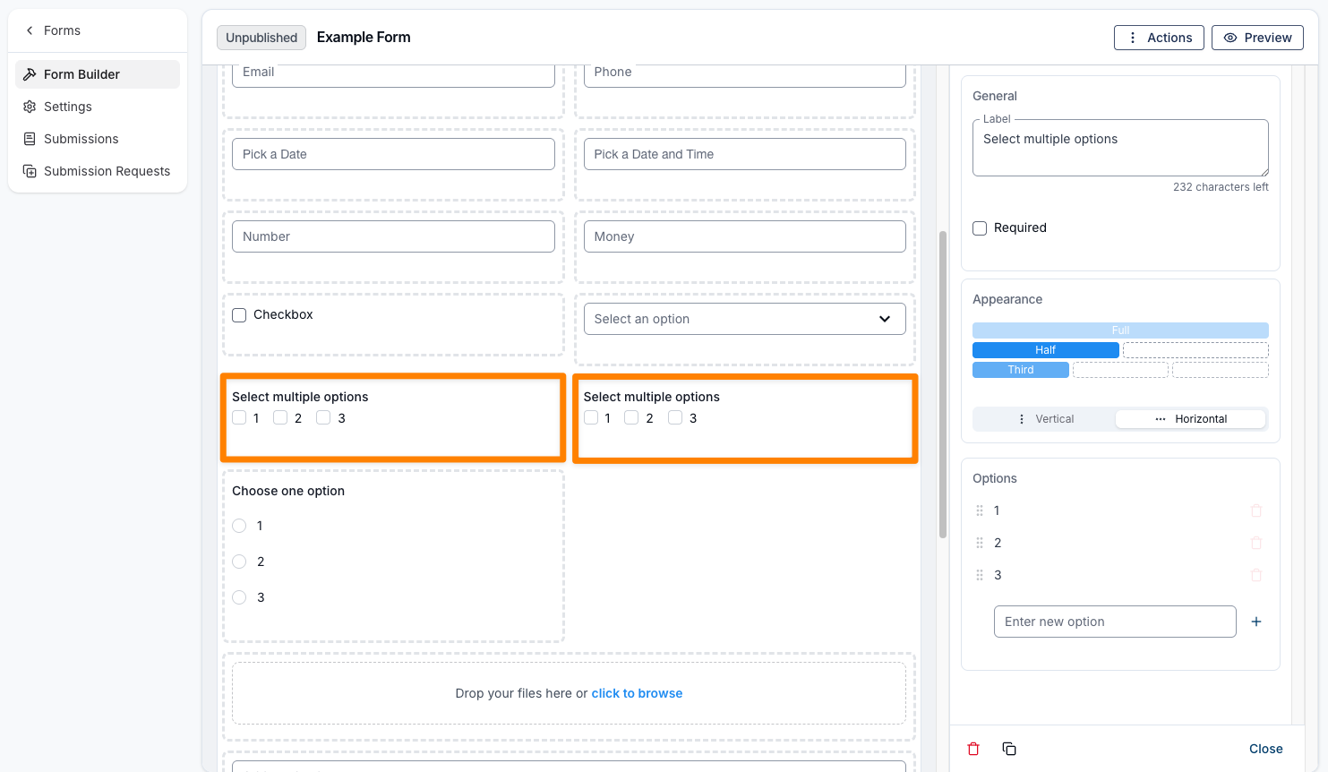
To duplicate a field, open the field you wish to copy and click the Copy icon. An exact duplicate will appear next to or below the original field, where you can make any necessary adjustments.
Finalising a Form
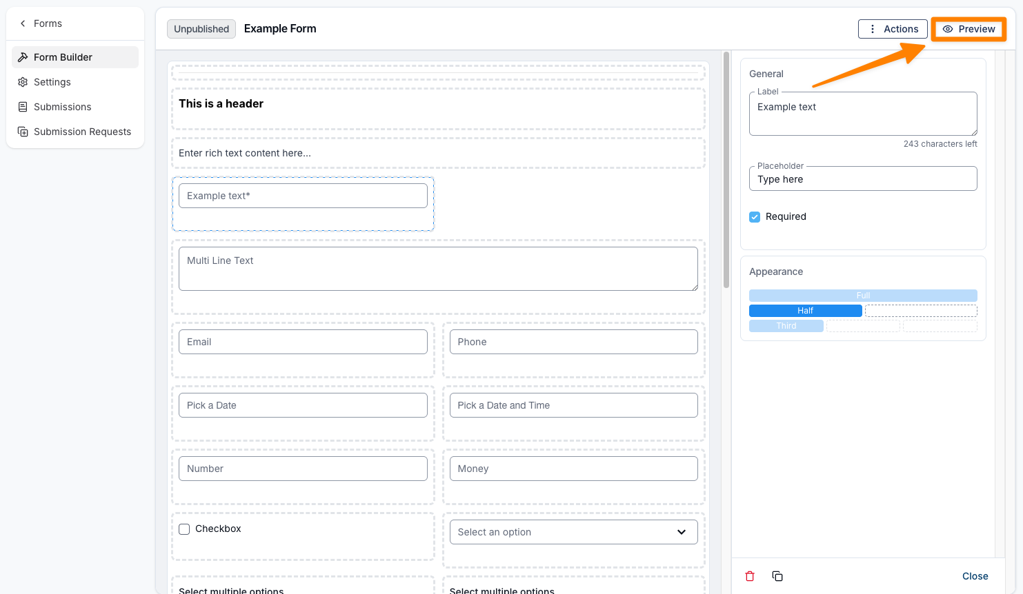
Before publishing, you may wish to preview the form to ensure everything appears as expected. To preview the form, simply click Preview in the top-right corner of the Form Builder. This will open a preview of the form in a new window.
There may be a few settings you’d like to adjust first. To learn more about the available options for the type of form you're editing, click here to view our user guide on the topic.
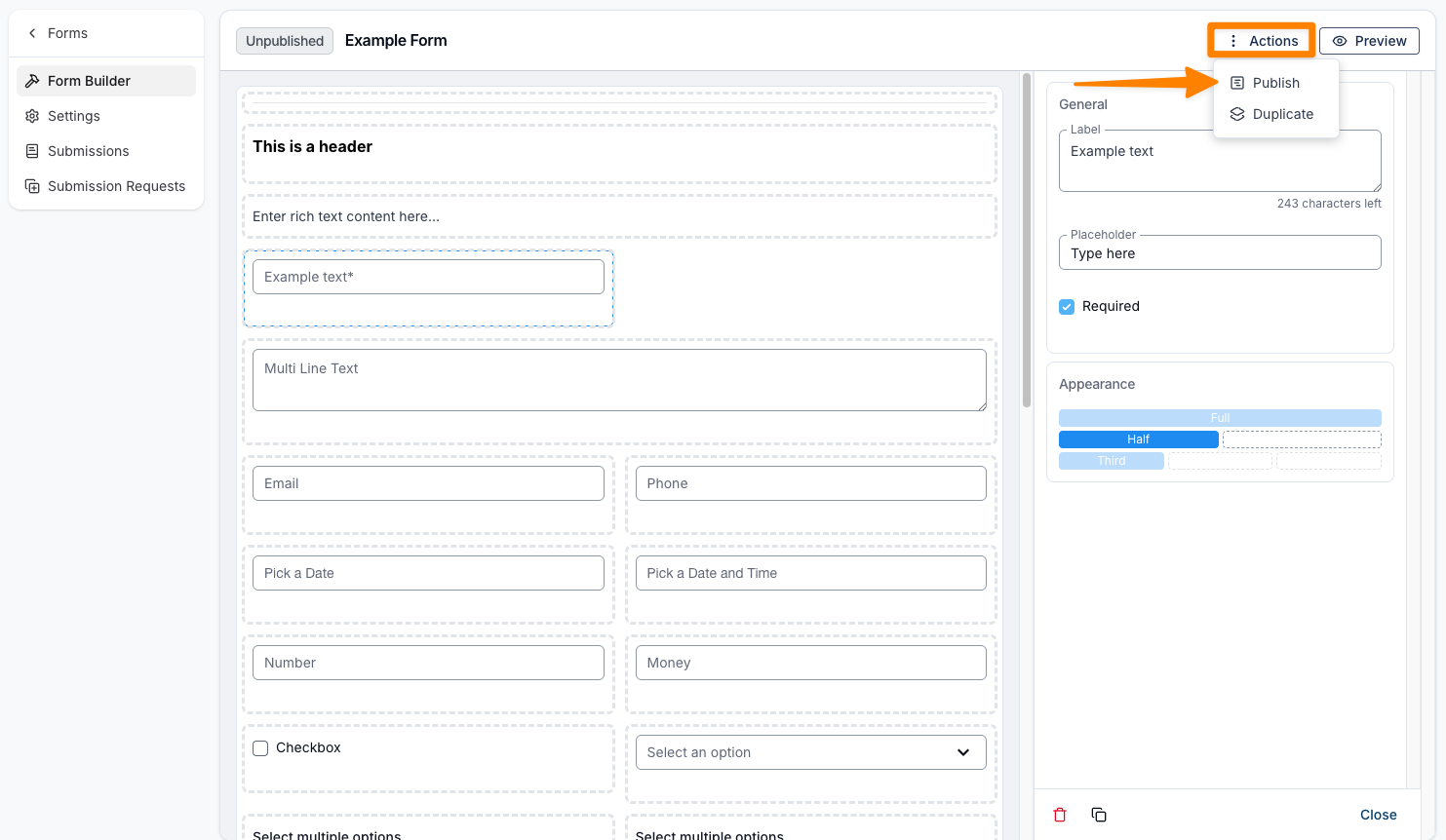
Once you’re happy with the form and have selected the appropriate settings, click the Actions button in the top-right corner and choose Publish to make the form live. You can also duplicate the form from this menu.
Duplicating a Form
You may wish to duplicate a form to create a secondary version, allowing you to make edits while keeping both the original and the new form available for use.
To duplicate a form, open the relevant form, click Actions in the top-right corner, and select Duplicate.